Introduction
Welcome to this in-depth guide on Blocks, the building blocks of the Empress workspace. Blocks are an integral part of the Empress framework, allowing developers to create fully customizable workspaces with a myriad of functionalities.
Throughout this guide, we’ll explore the nine existing types of Blocks, while outlining their purposes, functionalities, and customization options. We’ll delve into their implementation, modification, and debugging, providing comprehensive insights into this powerful feature.
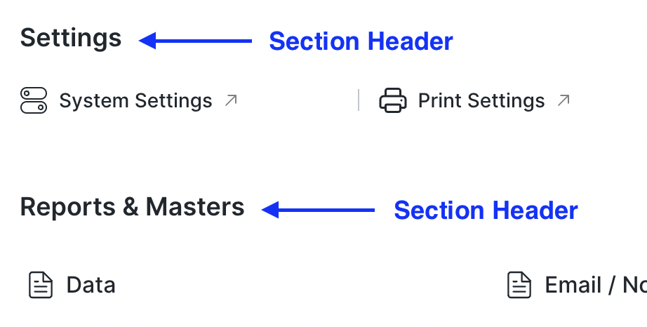
An Overview of Blocks
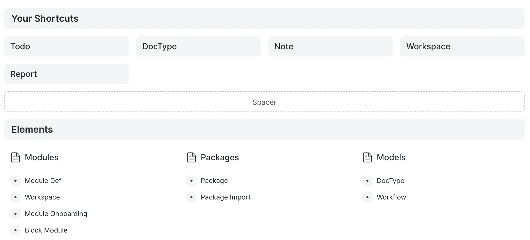
Each Block type serves a unique purpose, offering various ways to shape your workspace. Let’s dive into each Block type:
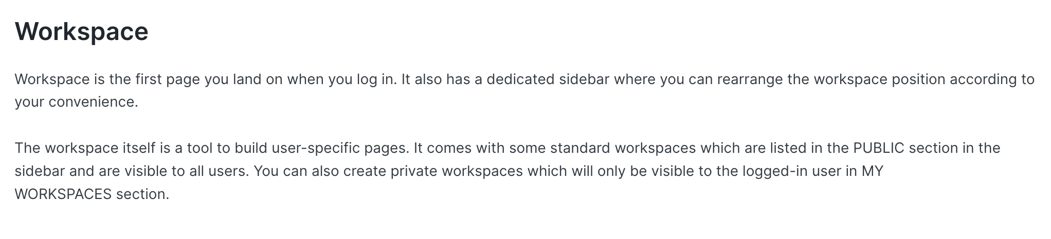
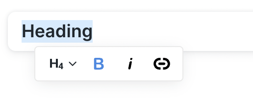
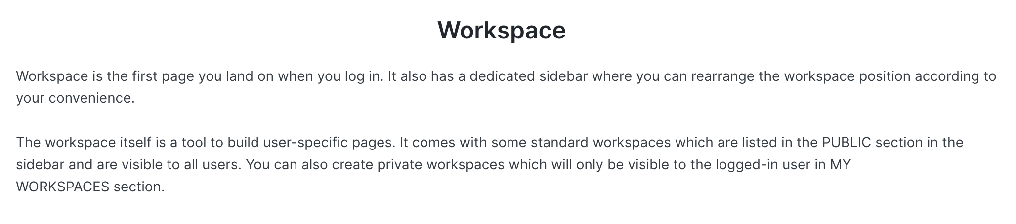
Heading Block
A Heading Block acts as a header for sections or paragraphs. It’s perfect for structuring your workspace and improving navigability.
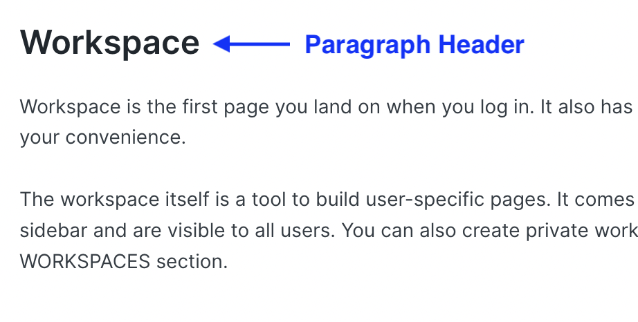
Text Block
The Text Block is used as a paragraph or description for any section. It helps to provide context or additional information within your workspace.
Both the Heading and Text Blocks come with an inline toolbar. This toolbar currently supports header sizes from H1 to H6, bold, italic, and links.
Card Block
A Card Block contains several links for quick navigation, which can be a DocType, Report, or Page.
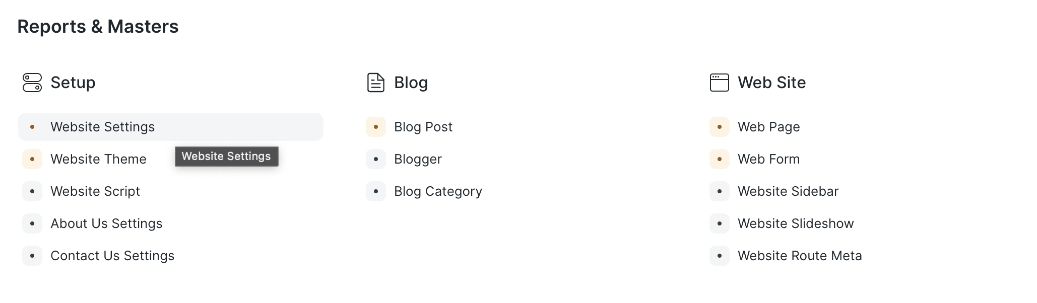
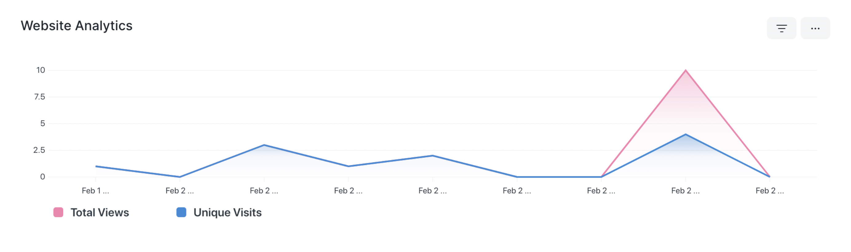
Chart Block
The Chart Block allows you to add any Dashboard Chart to your workspace.
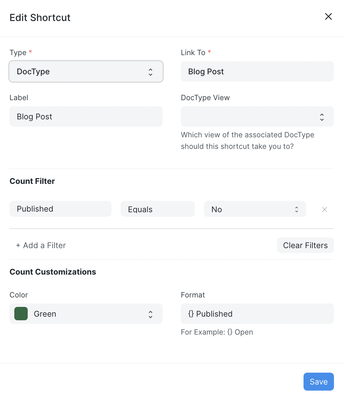
Shortcut Block
The Shortcut Block facilitates quick navigation to any DocType, Report, or Page. It can also be customized to select the view and add filters that will be applied when you open the selected view.

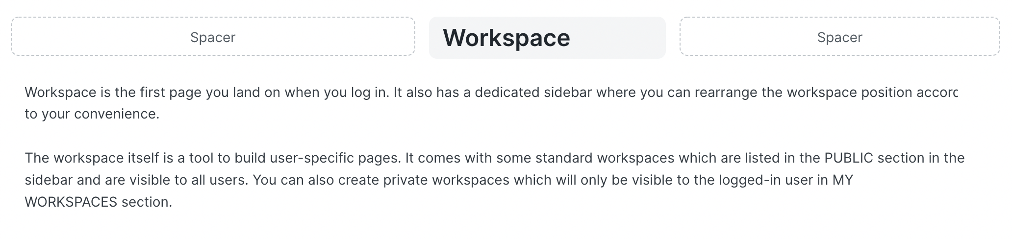
Spacer Block
The Spacer Block is used to add space between two blocks or to position other blocks by adding white space before or after the block.
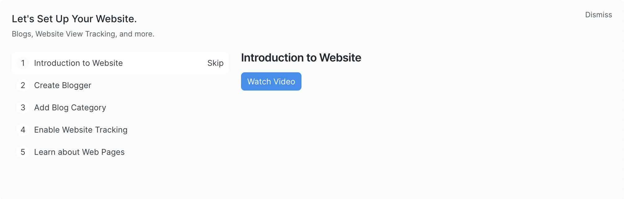
Onboarding Block
The Onboarding Block guides first-time users when they land on your page. It includes steps to learn a specific module.
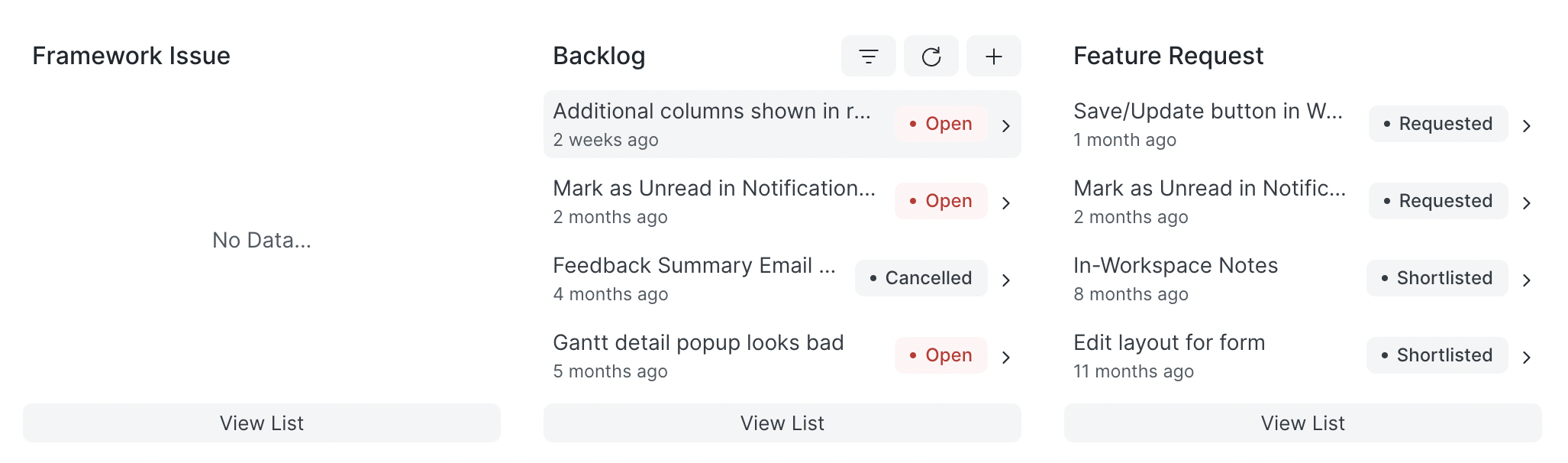
Quick List Block
The Quick List Block displays recently updated records of selected doctype and allows for some filters. It also features options to refresh the list, update filters, create new records, and open a doctype’s list view.
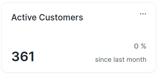
Number Card Block
The Number Card Block lets you add any existing Number Card to your workspace.
Conclusion
The Blocks feature provides a robust and flexible method to customize your Empress workspace. By understanding and utilizing each type of Block, you can transform your workspace into a more intuitive and efficient environment. As this feature continues to evolve, developers can expect even more tools and functionalities to streamline workspace customization and enhance user experience.